by Hatty Lee/ Color Lines
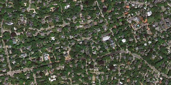
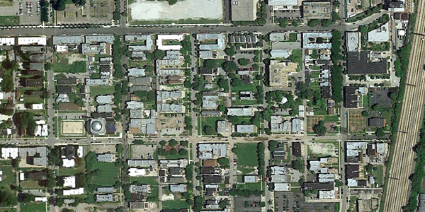
Turns out there’s a direct correlation between the number of trees a neighborhood has and its monetary wealth — and we can see how this dynamic plays out in space. Environmental journalist Tim De Chant mapped it all out for us on his blog, Per Square Mile, where he worked up a small project called “Income Inequality, As Seen From Space.”
De Chant took satellite images from Google Earth that compared two neighborhoods from selected cities to show income disparities. I was able to chat with him on the phone about the inspiration for his work and the impact it has had on readers.
Tell me a little bit about how you got into environmental writing.
I got my Ph.D. in environmental science at UC Berkeley where I studied the effects of urbanization on California’s oak woodlands. In grad school, I also taught environmental education for Team Oakland, a job training program for high school students. They got one day a week off from their jobs — which unfortunately had devolved over the years to picking up garbage in parks due to reduced funding — for the courses. It was a great experience. We’d switch up the locations where we met, ranging from parks in Oakland to the UC Berkeley campus. Many of the students weren’t used to “the great outdoors”, and I think that’s in part due to a lack of tree cover in their neighborhoods. That experience made an impression on me.
After graduation, I got into science writing and exploring urbanization, nature and ecosystems.
What inspired this particular post on visualizing income inequality through trees?
I write a post once or twice a week on scientific research that is out there. I had stumbled across a paper that spoke on how different income groups and neighborhoods showed what economists call “demand for trees.” Wealthy people demand more trees, and have money to pay for them and the land needed. They found that for every one percent increase in income, the demand for trees increased by 1.76 percent. According to economists, this correlation reflects a luxury good. This was pretty disheartening. I don’t think trees should be a benefit reserved for the wealthy.
You can see these disparities easily on Google Earth. I spent lots of time on my dissertation looking at aerial maps. And in the last 10 years, or even earlier, Google Earth has become really popular and an easy way to showcase the very evident difference.
Why did you pick cities like Oakland and Boston?
I picked these cities halfway at random. I wanted them to be familiar but somewhat representative, and cities that had wealthy and lower-income neighborhoods. I live in Boston. The Somerville neighborhood is still middle-income but not as wealthy as West Cambridge. So they are relative comparisons.
What type of impact has this project has so far?
I’m really glad and surprised at the impact the post has had. I’ve received a hundred or more emails and comments for the post. People are really taking this idea and applying it to their own cities and neighborhoods. I’m working on a follow-up post with submissions from readers. [De Chant had asked for readers to send in photos and example of cities of their choice.]
*****
Click here to see more of some of the maps from De Chant’s post. The median household income numbers have been added by Colorlines.com.


Reblogged this on NonviolentConflict.
sounds not well put together because there are low income neighborhoods with more trees in Portland, Seattle, Vancouver, than higher income neighborhoods in say, Phoenix or Denver, cities build on top of desert.